AI experience design
Designing AI Experiences People Can Correct
A practical guide to making assumptions visible, preserving user intent, and helping people recover when an AI system gets the task wrong.
In this guide
- What makes an AI flow correctable?
- Show the assumptions that affect the result
- Match clarification to consequence
- Separate a suggestion from a completed action
- Preserve intent when something changes
- Evaluate recovery as part of the core flow
- Make feedback specific enough to improve the system
- Review your next AI flow
- Put this into practice
- Sources and further reading
What makes an AI flow correctable?
Make the system’s interpretation, action status and correction controls visible. Preserve confirmed details during retries, and test what happens when a request changes or a service fails.
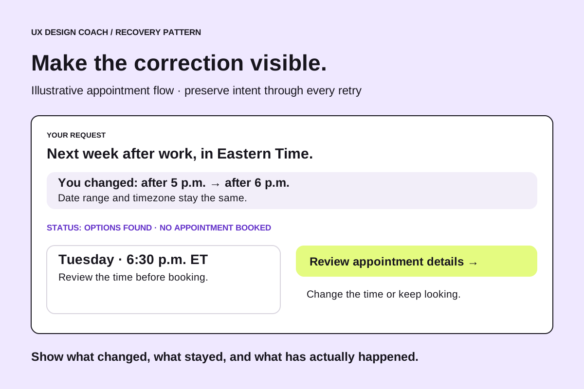
A customer asks an assistant to find an appointment next week. It returns three times and a confident explanation. The screen looks complete, but the customer cannot tell which timezone the times use, whether they are still available, or whether selecting one will create a booking.
The response may be fluent. The experience still leaves important decisions unresolved.
AI interfaces need to help people understand what the system interpreted, what it has done, and what they can change. That work becomes especially important when a request can be phrased in many ways and the response varies from one attempt to another.
Spotify’s account of AI product management across research, models, and experiences highlights this responsibility at the experience layer. The following appointment example is fictional; it shows how designers can apply that idea to a practical flow.
Show the assumptions that affect the result
People should not have to infer how the assistant interpreted a request when that interpretation changes their options.
For “Find me something next week after work,” the interface might display an editable interpretation: next Monday through Friday, after 5 p.m., in Eastern Time. If the location is unknown and determines availability, the assistant should ask for it before presenting definitive results.
The purpose is to expose assumptions the user can meaningfully correct. A short summary of constraints is more useful than a long account of internal processing.
This also gives the designer a concrete research question: can a participant identify the interpreted date range and change it without rewriting the entire request?
Match clarification to consequence
Asking a question has a cost. So does guessing. Design the interaction around what could happen if the interpretation is wrong.
An assistant recommending articles might proceed with a visible assumption and allow easy refinement. An assistant preparing an appointment needs the date, time, location, and timezone to be clear before the booking is committed. The appropriate checkpoint depends on the user’s authorization and the consequences of the action.
| Situation | Useful response | What to test |
|---|---|---|
| A preference is missing | Offer a starting point with an editable assumption | Can the user change the preference easily |
| A necessary detail is missing | Ask one focused question | Does the question explain what is needed |
| An action would create a commitment | Make the action and key details explicit | Does the user understand what will happen |
| Availability cannot be verified | Explain the limitation and offer another route | Can the user continue without being misled |
These are proposed design patterns, not universal requirements for every conversation. Test them against the task and audience.
Separate a suggestion from a completed action
The interface should distinguish between finding an option, selecting it, requesting it, and successfully booking it.
A button labeled “Continue” may conceal that distinction. “Review appointment” and “Confirm booking” make the next step easier to understand. Once the action succeeds, show the confirmed details and an appropriate way to manage the appointment.
If the booking service fails, keep the selected option visible and explain that the appointment has not been confirmed. Avoid a success message based solely on the assistant’s generated text. The application should use the booking system’s returned state.
This is a collaboration point between design and engineering. A clear confirmation screen needs a dependable signal about what actually happened.
Preserve intent when something changes
Suppose a customer says, “Keep the same provider, but make it Thursday.” A poor recovery experience restarts the entire search and loses the provider preference. A useful one changes the date while retaining the other constraints.
Design a visible place for the current request: provider, date range, time preference, location, and timezone. Let users edit individual fields. Conversational input can remain available, but it should not be the only way to correct a structured detail.
The same principle applies to generated documents and project plans. Preserve edits. Make it possible to revise one section. Explain whether retrying will replace the existing result. If an action is reversible, provide a clear route to reverse it.
Microsoft’s Guidelines for Human-AI Interaction address behavior at first use, during normal interaction, when the system is wrong, and over time. They provide a useful reference for reviewing the full experience rather than judging only its initial response.
Evaluate recovery as part of the core flow
A usability study should include moments when the system is incomplete or mistaken. Otherwise, the team can miss the work people must do to make the product usable.
For the fictional appointment assistant, give participants tasks that include an ambiguous timezone, a changed preference, and an option that becomes unavailable. Observe whether they understand the problem and can continue while preserving the information that still applies.
Record time to a correct outcome, corrections required, abandoned attempts, and misunderstandings about action status. Keep those observations separate from whether participants say the assistant sounded helpful.
A failed first attempt followed by a quick, understandable recovery may reveal a workable design. Repeated cycles of the same correction suggest that the product is not retaining or respecting the user’s intent.
Make feedback specific enough to improve the system
A thumbs-down response gives the team limited information. A short optional follow-up can distinguish between “wrong time,” “ignored a preference,” “booking failed,” and “unclear what happened.”
Combine feedback with the minimum relevant context needed to investigate, using appropriate consent and access controls. Give users a way to report a problem without requiring them to diagnose the technical cause.
The resulting pattern may point to the interface, source data, a model instruction, or an integration. Designers can help translate the observed failure into a reproducible scenario for the wider team.
Review your next AI flow
Choose one task and walk through it with an intentionally incomplete request. Then change a detail halfway through. Finally, simulate an unavailable service or failed action.
At each point, check whether the user can answer four questions: What did the system understand? What has actually happened? What can I change? How do I continue?
Bring the weakest moment into your next design review, together with the proposed change and a task that will test it. The goal is a flow people can use confidently because they can understand and influence what happens.
Put this into practice
Practice with the AI for UX learning path or bring one difficult journey to a UX Decision Review. For responsibilities beyond the interface, read Who Owns Quality in an AI Product.
The appointment scenarios and review method are original illustrative applications.
Sources and further reading
- Spotify Engineering: AI Product Management at Spotify: A View From Three Angles (November 9, 2026)
- Microsoft Research: Guidelines for Human-AI Interaction
Sources checked November 16, 2026. Review the linked publisher information for current details.
Put one idea to work
Bring one AI flow and the point where users get stuck. Turn the review into a focused improvement you can test.
Get a UX Decision Review →Explore more from UX Design CoachGet design practice in your inbox →Keep practicing
 Agent-friendly websites
Agent-Friendly Website UX: A Practical Audit Checklist
A practical UX guide to agent-friendly websites: accessible controls, clear states, llms.txt, task testing and a worked booking-flow example.
November 11, 2026 · 8 min read AI browser workflows
Use ChatGPT and three browser tabs for a more useful UX review
Compare visible interface patterns, keep observations separate from assumptions, and turn the review into one design question. Includes five illustrated steps and an example evidence log.
November 11, 2026 · 8 min read