AI browser workflows
Use ChatGPT and three browser tabs for a more useful UX review
Compare visible interface patterns, keep observations separate from assumptions, and turn the review into one design question. Includes five illustrated steps and an example evidence log.

In this guide
- The useful starting point
- Choose comparable moments in the journey
- Before you begin: connect the browser you actually mean
- Step 1 — Open side chat beside one public page
- Step 2 — Name the three tabs and the decision
- Step 3 — Check the answer against the original pages
- Worked example: turn a pattern comparison into a design question
- Step 4 — Review the tab list, then group only those tabs
- Step 5 — Finish with a recommendation and one open question
- Try the same method on a single article
- Your finished-work checklist
- Put this into practice
- Questions you might be asking
- Sources and further reading
The useful starting point
Choose three relevant public pages, state the decision criteria, verify the comparison, and keep a short source-linked recommendation. Group the reviewed tabs in Work only where that action is available.
Three onboarding pages can give you useful design references. They cannot tell you how real users experience the entire product. Use AI to organize what is visible, then apply your judgment to the unanswered questions. That distinction makes a browser comparison a stronger starting point for design work.
Choose comparable moments in the journey
A marketing hero, an account-creation form, and a logged-in dashboard are different stages. Either compare the same stage across products or name the difference in the table. Ask AI to report what is actually visible, with page links and short paraphrases. Hidden validation, keyboard behavior, and recovery flows stay unverified until you test them.
Before you begin: connect the browser you actually mean
OpenAI documents a browser extension that can use open tabs and provide side chat. In the desktop setup, open Settings → Computer Use, choose your browser, and follow its installation flow. That route points you to the appropriate extension. Use the profile where you installed it. Availability and controls depend on your account, app version, and workspace settings.
This guide uses a public-page practice task. The cover is AI-generated editorial imagery; the five step graphics are conceptual illustrations, not screenshots of an actual ChatGPT session. Allow about 20 minutes for a first attempt; that is a suggested practice time, not a measured result.
Step 1 — Open side chat beside one public page
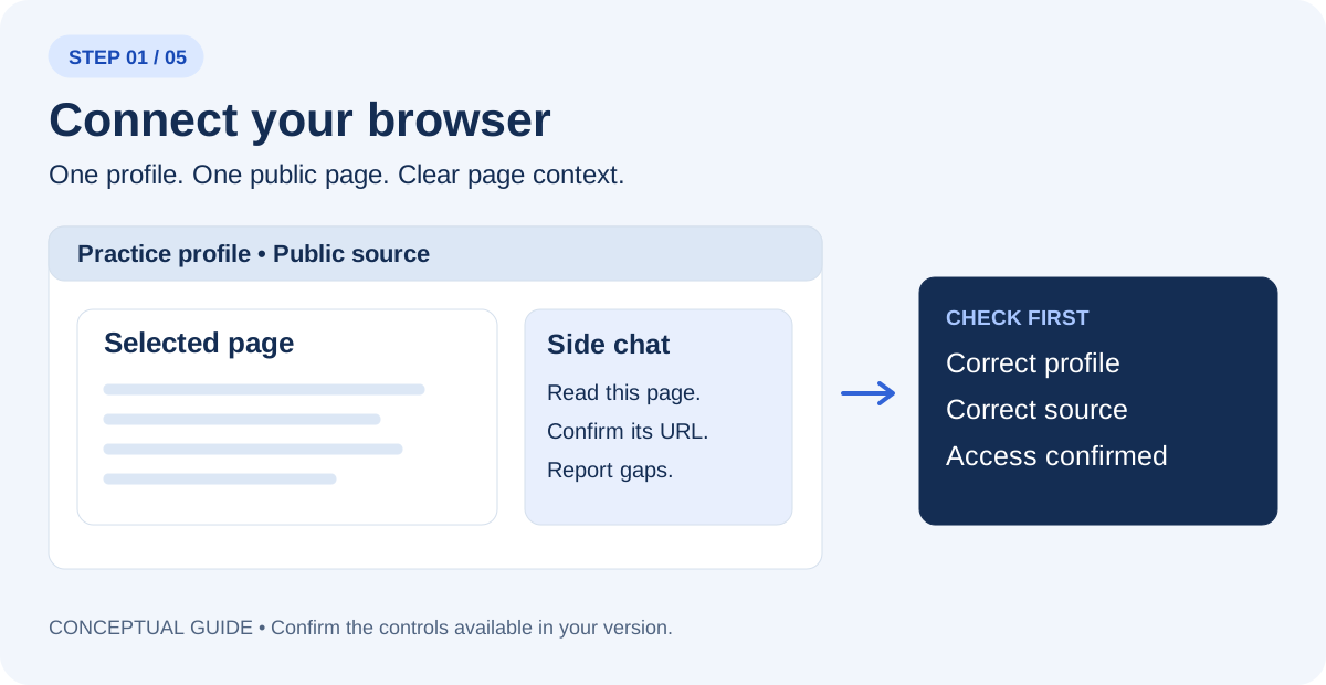
Open one of your sources and select ChatGPT from the browser toolbar or Extensions menu. Use the tab mention or page-context control your version provides. Begin in Chat for reading where available. If the panel cannot see the page, confirm the correct profile and connection before continuing.
Read only the page I selected. Tell me its title and URL, what information you can actually access, and anything you cannot verify. Do not change the page.
Step 2 — Name the three tabs and the decision
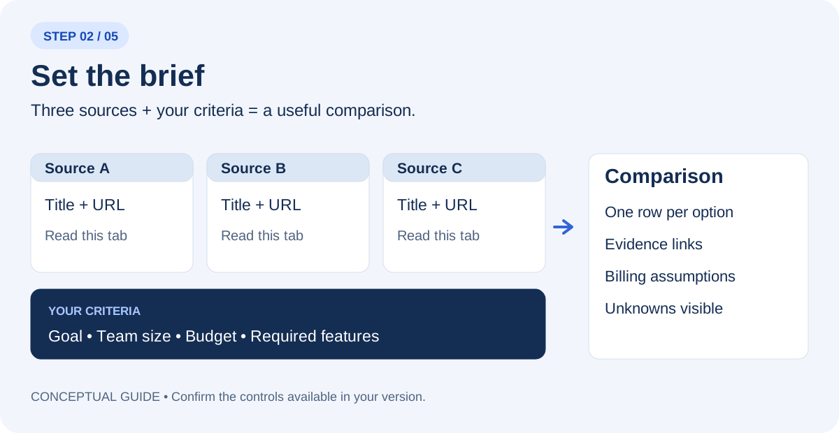
Open three public onboarding or product-explanation pages. Select or mention each tab explicitly. Replace the placeholders in this prompt with the actual page titles or URLs. A list of links is not proof that ChatGPT has read every page; ask it to identify any failed or partial reads.
Use only these three tabs: [title and URL 1], [title and URL 2], [title and URL 3]. My task: Compare three public onboarding or product-explanation pages for a new-user journey. Record the first action, visible requirements, help, error guidance, and unresolved questions. Do not infer task success from appearance. Create a comparison with one row per option, the source URL for each important claim, and a separate column for missing information. Use “not verified” when a page does not establish a detail. Do not start trials, buy, register, or send messages.
Step 3 — Check the answer against the original pages
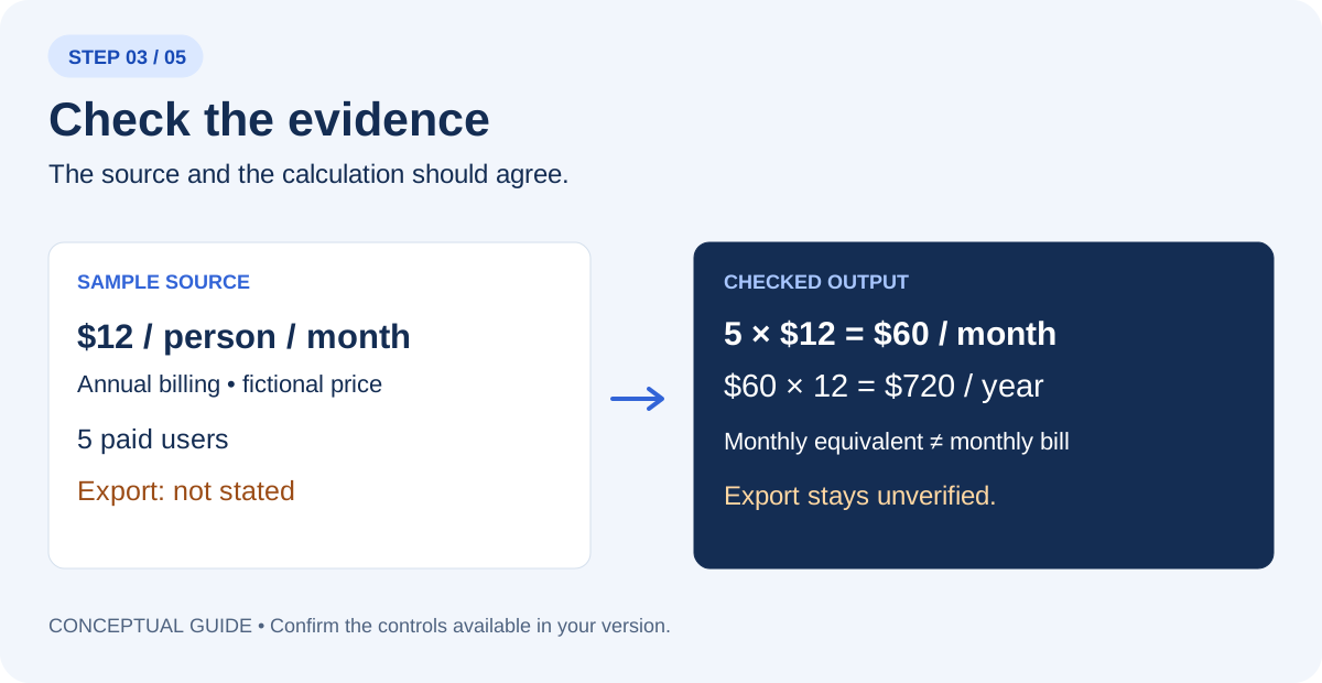
Open the source behind each decision-changing claim. Separate a visible statement from AI’s interpretation. For prices, check currency, billing period, paid-seat count, minimum seats, required add-ons, and any tax or fee exclusions. For events, check date, time zone, venue, and registration status. Do not convert a blank field into a favorable assumption.
Audit your comparison against the three source pages. For each important claim, show the supporting page and explain the calculation or inference. Mark contradictions and missing details. List what I must confirm before making the decision.
Worked example: turn a pattern comparison into a design question
Illustrative scenario. The sample pages below are invented to demonstrate the reasoning, not a report of a completed browser test.
| Fictional page | Visible observation | Unverified or unresolved |
|---|---|---|
| Sample page A | One prominent start button | Required information appears later |
| Sample page B | Checklist before account creation | Error recovery not visible |
| Sample page C | Several equally prominent actions | Primary path is ambiguous |
Example decision note: A useful next test is whether showing requirements before the first action helps new users start with fewer questions. The comparison alone cannot establish which page is easiest to use.
Record exact screen or page context with every observation. Do not report accessibility compliance from a static page read. Keyboard operation, focus order, errors, and assistive-technology behavior require appropriate interaction testing.
Step 4 — Review the tab list, then group only those tabs
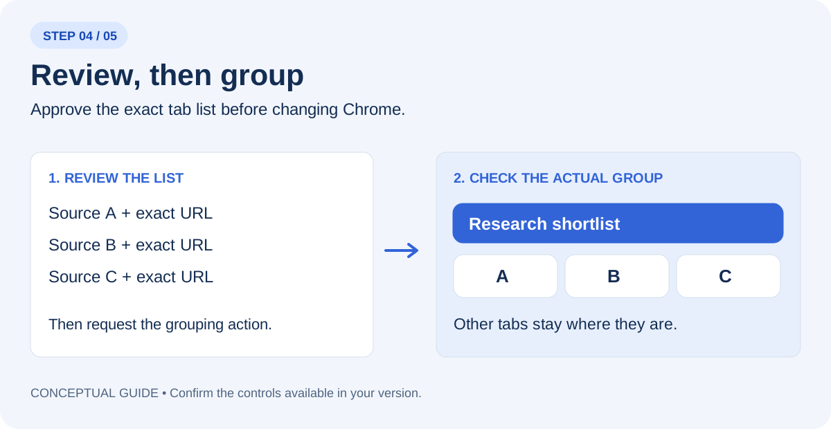
If browser actions and tab grouping are available in Work, select that mode and name Chrome explicitly. Reading pages and changing the browser are separate tasks. First ask for a preview of the three tab titles and URLs. After you check the list, request the grouping action below. Inspect the actual Chrome group afterward.
In Chrome, show me the exact three tab titles and URLs you would group as “Onboarding pattern review”. Do not change the browser yet.
Group only those three reviewed tabs as “Onboarding pattern review”. Leave the other tabs where they are. Do not close pages, navigate to checkout, register, or send anything. Report the group name and the tabs actually included.
If grouping is unavailable, create the group manually in Chrome and keep the comparison. A useful research result does not depend on this optional action. If the extension fails to connect, use OpenAI’s linked troubleshooting guidance; do not grant wider access just to complete a practice exercise.
Step 5 — Finish with a recommendation and one open question
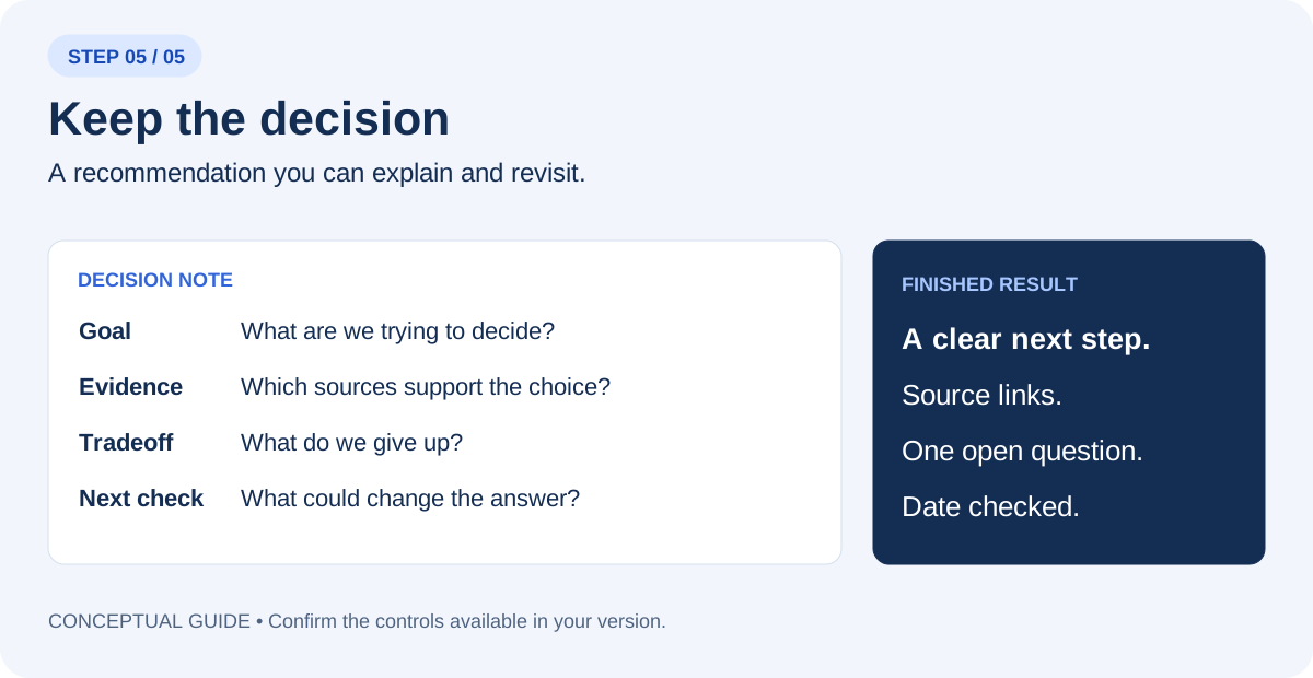
Write a decision note under 150 words: the goal, the best-supported next step, the source links, the main tradeoff, and one unanswered question that could change the recommendation. Distinguish facts, calculations, and your judgment. If the evidence is insufficient, recommend the next check instead of choosing a winner.
Use the comparison to frame a design question, such as whether explaining requirements before the first action reduces confusion. Build a small prototype and observe people attempting the task. The reference review informs the hypothesis; user research and interaction testing supply evidence about whether the design works.
Try the same method on a single article
Select the article tab and ask for a short evidence review. This is useful when a headline makes a broad promise but the body describes a narrow example.
What is the main claim in this article? What evidence does the author present? Which statements are interpretation, which details remain unresolved, and what original source would I need to inspect before relying on the claim? Include the article URL.
Your finished-work checklist
- The comparison uses the three sources you selected.
- Decision-changing claims link back to an accessible page.
- Costs and dates use the correct assumptions.
- Missing information remains visible.
- The actual tab group matches the reviewed list, if grouping was used.
- The final note names a next step and one question.
Save the note with the date checked. When a price, policy, or event changes, revisit the original page before reusing the recommendation.
Put this into practice
Turn the observation log into a research question, a prototype decision, and an explicit standard for review.
Questions you might be asking
Is the extension the same as the cloud browser?
No. Use the connected browser extension when the task depends on your existing Chrome tabs. Name Chrome and the selected tabs explicitly.
What if my account cannot group tabs?
Complete the comparison and create the tab group manually. The group is optional; source checking is the essential skill.
Sources and further reading
Sources checked November 11, 2026. Review the linked publisher information for current details.
Put one idea to work
Turn the observation log into a research question, a prototype decision, and an explicit standard for review.
Explore the UX decision worksheets →Explore more from UX Design CoachGet design practice in your inbox →Keep practicing
 Agent-friendly websites
Agent-Friendly Website UX: A Practical Audit Checklist
A practical UX guide to agent-friendly websites: accessible controls, clear states, llms.txt, task testing and a worked booking-flow example.
November 11, 2026 · 8 min read Practical AI workflows
Use Claude Whiteboards to make research decisions easier to inspect
Group observations, preserve participant context and connect a design change to a small evidence table.
November 11, 2026 · 7 min read