Build workshop · Landing pages
Build a landing page with AI: from a clear offer to a working conversion path
A practical brief, copy prompt, page structure, and launch checklist for a landing page that helps visitors take the right next step.
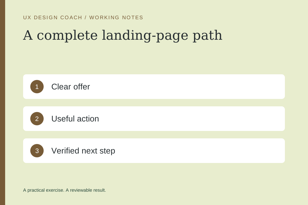
In this guide
The useful starting point
Start with one audience, one offer, and one action. Give AI verified facts, build the full response path, and test whether visitors understand what happens next.
Write the offer before the prompt
A beautiful page cannot repair an unclear offer. Define who the page is for, the problem it addresses, the deliverable, what it costs or how pricing is determined, and the next step. Use only real proof. If you do not have testimonials or measured outcomes, explain the process and show a clearly labeled sample.
Fictional exercise: a studio offers a review of one checkout journey. Its page should help a prospective client decide whether the review fits their problem and request a conversation. It should not imply that filling out a form purchases the service or reserves an appointment.
1. Give AI a constrained content brief
Draft a landing page for [audience] considering [offer]. Verified facts: [scope, process, terms, proof]. Primary action: [action]. Explain the outcome in plain language and include who it is for, what is included, how it works, and what happens after the action. Mark missing facts for me to supply. Do not invent testimonials, urgency, statistics, or guarantees.
Read the result aloud. Replace abstractions such as “transform your experience” with the specific work the visitor receives. Put the next step close to the offer, not after a long sequence of generic benefits.
2. Build a page with a clear hierarchy
| Section | Visitor question |
|---|---|
| Hero and primary action | Is this for me, and what can I do? |
| Scope and sample | What will I receive? |
| Process and expectations | What happens after I act? |
| Relevant proof | Why should I trust this? |
| Questions and final action | What uncertainty still stops me? |
Use a tool that creates an editable page or functional prototype. Figma Make can help explore the interaction; a coding assistant can help implement it in your actual project. Confirm which parts are prototypes before collecting real data.
3. Design the form’s whole story
Ask only for information needed at this stage. Use explicit labels and an understandable error beside the relevant field. Retain entered values after failure. A success state should describe the confirmed event: “Your request was received” only after a real save, and “Check your inbox” only when a message was actually queued or sent, with its limits understood.
Review this page’s request flow. List the empty, invalid, submitting, successful, and failed states. For each, describe what the visitor knows, what data is preserved, and their next action. Flag claims that the implementation cannot yet substantiate.
4. Test the promise end to end
Use an owner-controlled test address and a clearly labeled test submission. Verify the stored request, the owner alert, and the visitor receipt separately. Check the destination of every primary button. Test keyboard use and narrow screens. W3C’s evaluation resources are a useful starting point, with human evaluation still required.
5. Measure a meaningful result
Record page views, action starts, successfully received requests, and qualified follow-ups as distinct events. Do not count a click as a lead. Run one change at a time when traffic is small, and describe results cautiously when the sample is limited.
Before handoff, use the existing landing-page review guide. For a second set of eyes on one journey, explore Ashley’s UX Decision Review.
Sources and further reading
Sources checked November 4, 2026. Review the linked publisher information for current details.
Put one idea to work
Take the next step with a practical worksheet, a clear research question, and a standard you can use to review the work.
Explore design worksheets →Explore more from UX Design CoachGet design practice in your inbox →Keep practicing
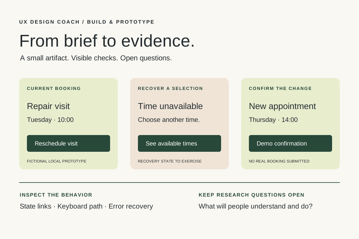 Build & prototype · Working with agents
From design brief to reviewable prototype: inference and the agent harness
Use a bounded prototype exercise to understand inference, agent harnesses, tool checks, and the human research still needed. Includes a copyable design task card.
November 5, 2026 · 7 min read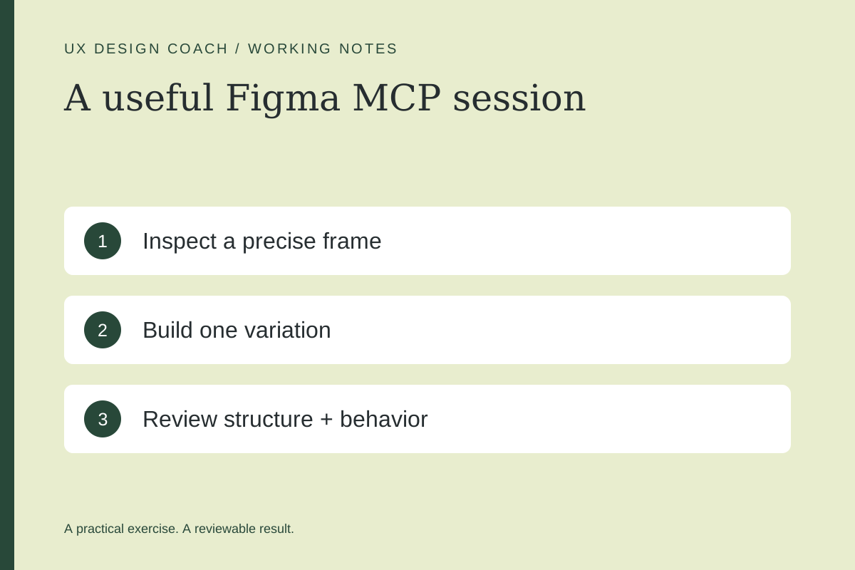 Tool workshop · Figma MCP
Figma MCP: turn your design system into a working AI partner
Connect Figma to an AI assistant, inspect a real frame, create a controlled variation, and check the handoff. Includes setup, prompts, and a troubleshooting checklist.
November 4, 2026 · 3 min read