Design review
Review an AI-generated landing page before the client handoff
A practical review that checks the visitor task, claims, keyboard journey and handoff notes before a polished draft becomes a live page.

In this guide
The useful starting point
Walk through one real visitor task, verify every business claim and destination, test basic keyboard and mobile use, and document what remains untested. A convincing screenshot does not establish that the page works or meets accessibility requirements.
AI can quickly produce a landing page that looks ready. The useful review begins where the screenshot ends: can the right visitor understand the offer, complete the next step and recover if something goes wrong? Treat the generated page as a proposal that needs evidence.
Write one visitor task
Choose a concrete task such as understanding a workshop's prerequisites and requesting the right format. Identify the intended visitor, their question and the action the business can actually support. If several buttons compete for attention, decide which one advances this task.
Read the opening screen aloud. Does it explain who the offer is for, what someone receives and how to proceed? Replace vague benefits with accurate scope. Remove invented testimonials, client logos, scarcity, prices and results before the draft is shown as finished work.
Follow the complete journey
Open each important destination. A working button can still lead to an irrelevant page, an expired booking or a checkout for the wrong product. Inspect success and error states. Use a safe test environment where submission would otherwise contact a real customer or create a paid order.
For a fictional workshop page, the design review finds that “Choose a session” opens a general contact form without carrying any context. The repair is to explain what happens after the request and make the workshop choice clear. The page should not claim a booking is confirmed when someone has only asked a question.
Run a first accessibility pass
Use a keyboard to reach the main links and form controls. Look for visible focus, sensible order and a way to leave any menu or dialog. Check meaningful headings, useful labels, image alternatives, readable contrast and text enlargement. W3C's Easy Checks provides a starting point for this review.
These checks are preliminary. Passing them does not establish full accessibility conformance. Record what was checked, the device and browser used, and any remaining specialist evaluation. Ask whether the page is understandable without the decorative image or animation.
Review the content as an answer
Put the direct answer to the visitor's question near the top. Add a clear explanation, a specific example and a relevant next step. Verify that the title, visible content, canonical address and any structured data describe the same page.
Google's AI search guidance keeps the emphasis on accessible, useful content and ordinary SEO fundamentals. There is no need to promise that adding a special file or a block of FAQs will make an assistant cite the business.
Hand over decisions, not just files
Prepare a short note with four parts: what changed; why it changed; what was verified; what still needs a decision. Include the source of approved offer details and the owner of each unresolved issue. Mark illustrative imagery clearly when it could otherwise be mistaken for evidence of a real event or customer.
Ask AI to review your notes with this prompt: Identify unsupported claims, ambiguous next steps and missing failure states in this page. Quote the relevant passage and explain the visitor problem. Separate direct observations from suggestions. Do not invent customer research or claim that you tested the live page.
Use the design worksheets to structure the review and the journal for related practice. When the issue spans the offer and conversion journey, the related Waymaker Growth Fix page explains the current service scope.
Sources and further reading
Sources checked October 18, 2026. Review the linked publisher information for current details.
Put one idea to work
Take the next step with a practical worksheet, a clear research question, and a standard you can use to review the work.
Explore design worksheets →Explore more from UX Design CoachGet design practice in your inbox →Keep practicing
 Forward-deployed design
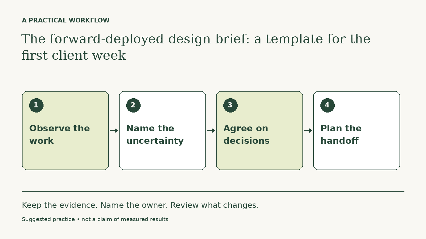
The forward-deployed design brief: a template for the first client week
Define the workflow, research access, decision rights, and handoff before an embedded designer starts producing screens.
October 16, 2026 · 4 min read AI for designers
A daily AI workflow that makes your design judgment more useful
Use AI to prepare briefs, explore alternatives, and inspect design details while keeping research, accessibility, and final judgment grounded.
October 16, 2026 · 6 min read