Tool workshop · Penpot
Penpot MCP: an open-source design workspace for your AI assistant
Use Penpot’s official MCP connection to inspect components, create a reusable screen, and keep your design system coherent.
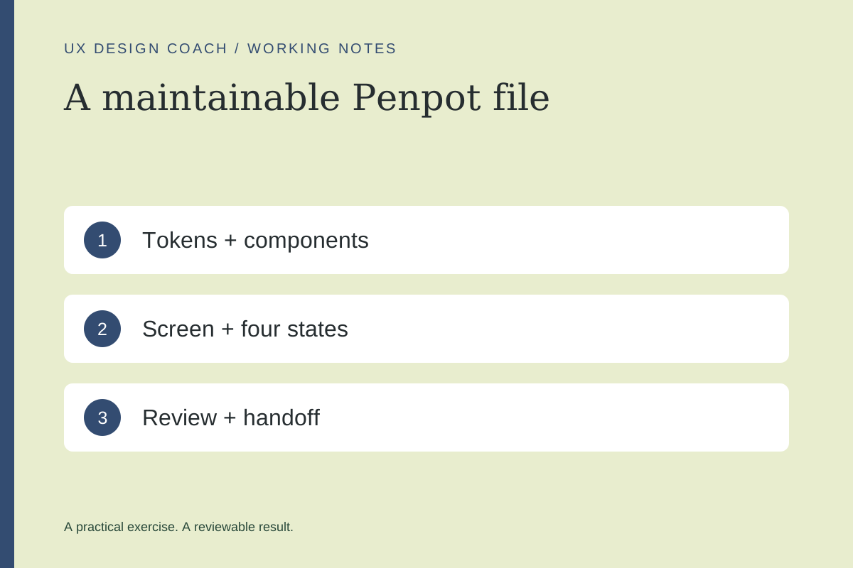
In this guide
The useful starting point
Penpot is an open-source design alternative with official MCP support. Begin with the hosted connection and a read-only check of one practice file.
Start with a small design-system exercise
If you want an open-source alternative to a Figma-centered workflow, Penpot belongs on your shortlist. This workshop uses a fictional account-settings screen to test whether an assistant can work with a consistent visual system. It is a practice exercise, not a claim that the tools are interchangeable.
Connect remote MCP
In Penpot, open Your account → Integrations → MCP Server. Enable it, generate your personal key, and copy the supplied server URL into your trusted MCP client. The URL contains a credential: keep it out of screenshots and shared examples. Open your practice file and use File → MCP Server → Connect. Keep that tab active; MCP follows the focused page.
For local setup, the official instructions currently start with npx @penpot/mcp@stable and a plugin loaded from http://localhost:4400/manifest.json. Follow the current client instructions rather than copying configuration from the archived standalone repository.
1. Define a system before generating screens
Create a small set of text styles, a spacing scale, two button styles, and one labeled input. Use meaningful names such as text/body, space/medium, and action/primary. Decide which choices are fixed and which the assistant may explore. A tiny coherent system teaches more than a huge collection of unrelated assets.
Inspect the focused practice page. List the components and tokens already present. Identify repeated raw values that might belong in the system. Return a proposed cleanup list without changing the file.
2. Build a settings screen with explicit constraints
Use a fictional service called Studio Notes. Its settings need a display name, email notification preference, save action, and clear unsaved-change state. The example contains no real subscriber or customer information.
Create a new Studio Notes settings board using the existing components and tokens. Include default, saving, saved, and failed-save states. Keep the preference label explicit. Preserve the current page’s original components. Report any new token or component you needed.
Compare all four states. Does the failed save preserve the person’s work? Does success say what changed? Can the layout accommodate a much longer label? These questions matter more than how quickly the board appeared.
3. Review the file as a teammate would
Select an instance and check whether it remains connected to the intended component. Inspect padding and text styles. Rename confusing layers and remove abandoned exploratory boards only after checking what references them. Ask the assistant for a short change list, then compare it to the actual file.
Choose Penpot with a real comparison
| Question | What to test |
|---|---|
| Can the team maintain the file? | Have another designer edit a component and understand the naming. |
| Does handoff preserve intent? | Implement one responsive state and compare it with the board. |
| Does the workflow fit your tools? | Check import, export, collaboration, and required integrations on an actual project. |
Practice outcome: one small system, one screen with four states, and a comparison note explaining where this workflow fits your team. Pair it with the Figma MCP workshop using the same brief.
Sources and further reading
Sources checked November 4, 2026. Review the linked publisher information for current details.
Put one idea to work
Take the next step with a practical worksheet, a clear research question, and a standard you can use to review the work.
Explore design worksheets →Explore more from UX Design CoachGet design practice in your inbox →Keep practicing
 Build & prototype · Working with agents
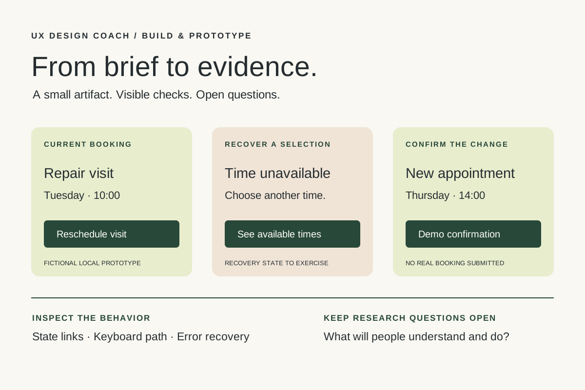
From design brief to reviewable prototype: inference and the agent harness
Use a bounded prototype exercise to understand inference, agent harnesses, tool checks, and the human research still needed. Includes a copyable design task card.
November 5, 2026 · 7 min read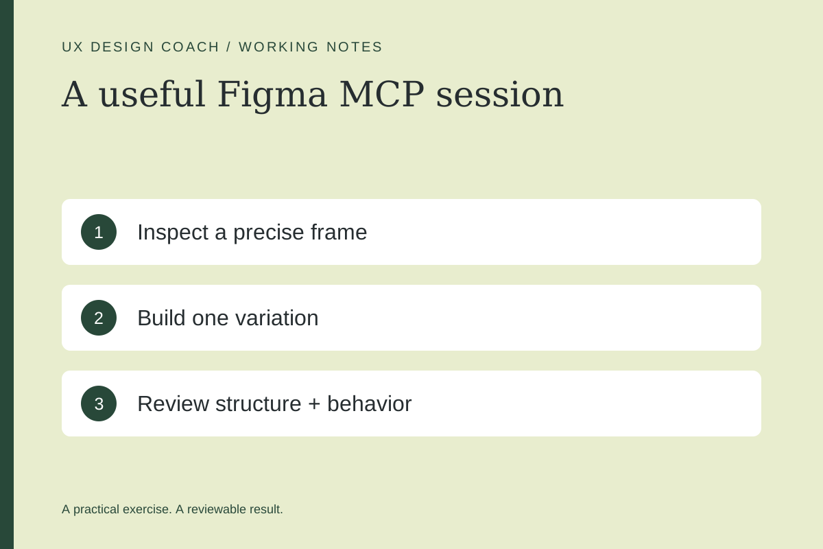 Tool workshop · Figma MCP
Figma MCP: turn your design system into a working AI partner
Connect Figma to an AI assistant, inspect a real frame, create a controlled variation, and check the handoff. Includes setup, prompts, and a troubleshooting checklist.
November 4, 2026 · 3 min read