AI interaction design
Designing AI agent experiences: approval, progress, errors and recovery
Five reusable interface states for AI actions, with an annotated state kit and practical checks for approval, partial failure and undo.
In this guide
- The useful starting point
- 1. Review: make approval specific
- 2. Working: report observed progress
- 3. Partial failure: preserve the successful work
- 4. Completed: show the receipt and the limits of undo
- 5. Recovery: let the user choose the next safe action
- Use the annotated state kit
- Check the interaction, not just the canvas
- Bring one difficult journey to a review
- Sources and further reading
The useful starting point
Design the moment before an action and the moment after it goes wrong. Show the target, intended change, evidence, current status and next safe action. Distinguish closing a panel, cancelling future work and reversing completed work.
An agent interface is a promise about what a system can do on someone's behalf. A polished chat response cannot carry that promise alone. People need to understand the proposed action, see what has happened, and recover when the result is incomplete.
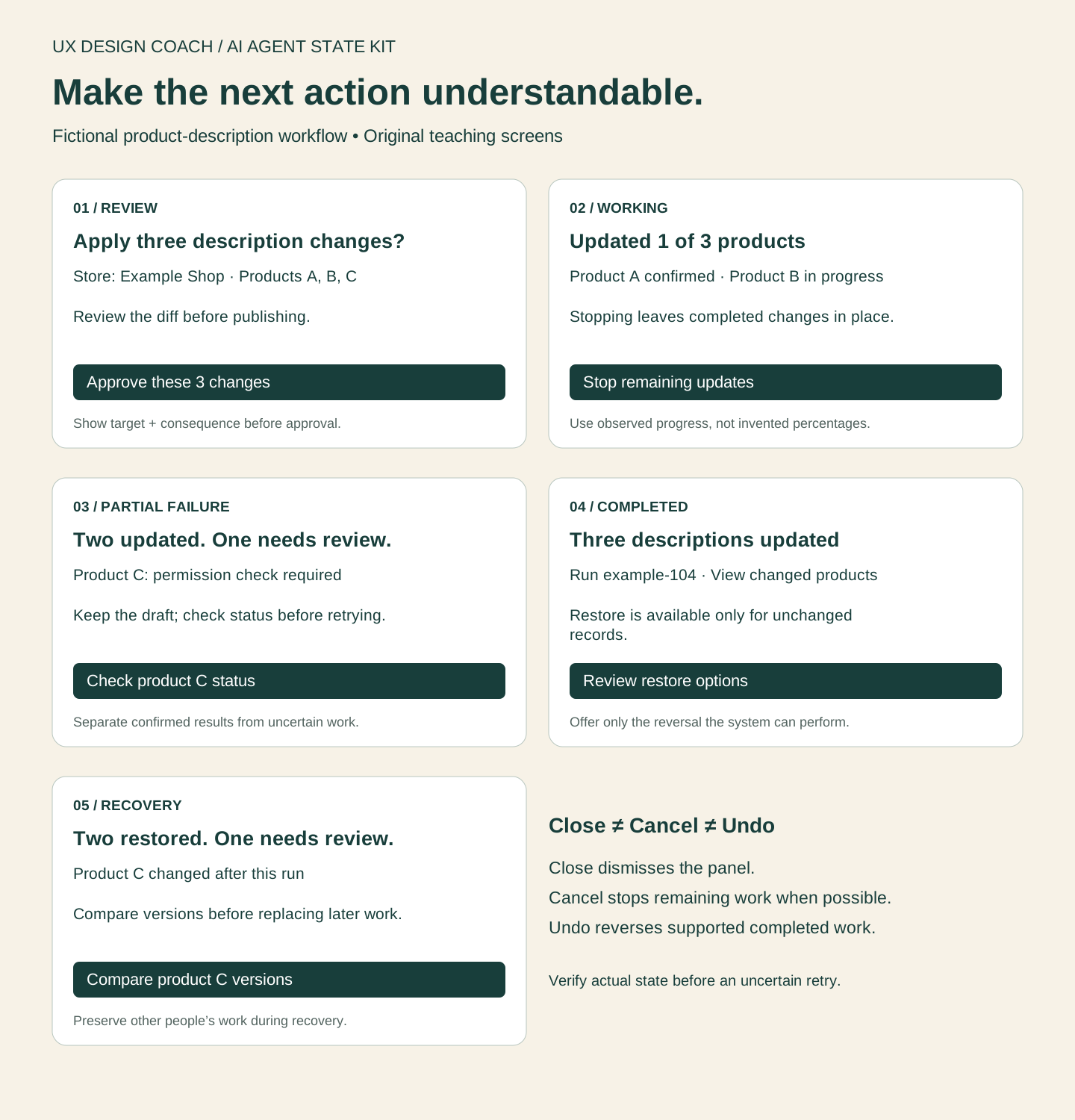
The examples below use a fictional workflow that updates three product descriptions. The screens are original teaching examples, not screenshots of a shipping product or evidence from a user study.
1. Review: make approval specific
Show the target store, the three products, the proposed text changes and who requested them. Say what approval authorizes: “Apply these three description changes.” Include meaningful consequences such as publishing visibility or known charges when relevant. “Continue” is too vague if the next step writes to a live store.
Make editing and cancelling available before approval. If a critical input changes, refresh the review rather than silently applying an old approval to new content. A user should be able to explain the consequence without reading internal tool names.
2. Working: report observed progress
“Updated 1 of 3 products” is useful if the service has confirmed one update. “72% complete” is misleading when the system has no basis for that percentage. Show the current step, confirmed work and a status-check option for a long operation.
Explain cancellation honestly. A stop request may prevent the remaining updates while leaving the first update in place. Closing the panel should not pretend to stop the job. Allow the user to return and find the same run record.
3. Partial failure: preserve the successful work
Use a concrete summary: “Two products updated. One needs review.” List each item with its observed status. Preserve the draft for the failed item and show a next action such as checking permission or reviewing a validation error. Avoid a red banner that makes the entire operation look lost.
Do not make “Retry all” the only recovery. If the request timed out after submission, the update might already have happened. “Check current status” can resolve that uncertainty before another write. When retry is appropriate, target the failed item and make duplicate handling an implementation requirement.
4. Completed: show the receipt and the limits of undo
Link to the changed records and show the completion time and run reference. A success message should follow confirmed results. Keep the original values when the product supports reversal, and say which changes can be restored.
Undo is a product capability, not a reassuring label. If a message has already been sent or a payment settled, explain the available corrective action. When another person has edited the same record, restoring an old value can erase their work; show the conflict and ask for review.
5. Recovery: let the user choose the next safe action
A recovery screen should answer what is known, what remains uncertain and what will happen next. For this example: “Two descriptions were restored. One changed after this run and needs your review.” Offer to compare versions instead of overwriting the later edit.
Keep activity history understandable: requested, approved, started, confirmed, failed and restored are different events. Provide a support path with a run reference. Avoid exposing secrets or implementation logs in the customer-facing message.
Use the annotated state kit
The downloadable annotated SVG maps the five states and can be imported into Figma. Each card includes the user-facing message, primary action and the design question it must answer. The companion Figma file contains reusable state variants and editable text properties.
Open the AI Agent State Kit in Figma. Figma may require access to the file; the SVG download is available without an account.
Check the interaction, not just the canvas
- Can a keyboard user inspect the proposal, edit it and approve it?
- Are errors explained in text and associated with the item or field that needs attention?
- Are meaningful status changes announced appropriately to assistive technology without repeatedly interrupting?
- Does focus return to a sensible place after a dialog closes or recovery completes?
- Can the user distinguish stopping future work from reversing completed work?
- Does the smallest supported screen retain the action summary and recovery choices?
W3C guidance on errors, validation and status messages supports these accessibility checks. The five-state model is our design framework; it still needs task-based testing with the people who will use your product.
Bring one difficult journey to a review
Choose an action that changes real work. Bring its happy path, one partial failure, the current permission model and the decision you need to make. The $750 UX Decision Review is a focused next step for reviewing that journey. See a sample review before deciding.
Sources and further reading
Sources checked October 20, 2026. Review the linked publisher information for current details.
Put one idea to work
Bring one agent journey, a difficult failure state and the decision you need to make.
Explore the $750 UX Decision Review →Explore more from UX Design CoachGet design practice in your inbox →Keep practicing
 Useful AI Beats Hype · Design
Build a UX design-review skill: a step-by-step illustrated guide
Turn a small interface flow into an evidence-linked review, a prioritized fix list, and a usability test plan. Includes a complete skill template and a worked example.
November 1, 2026 · 8 min read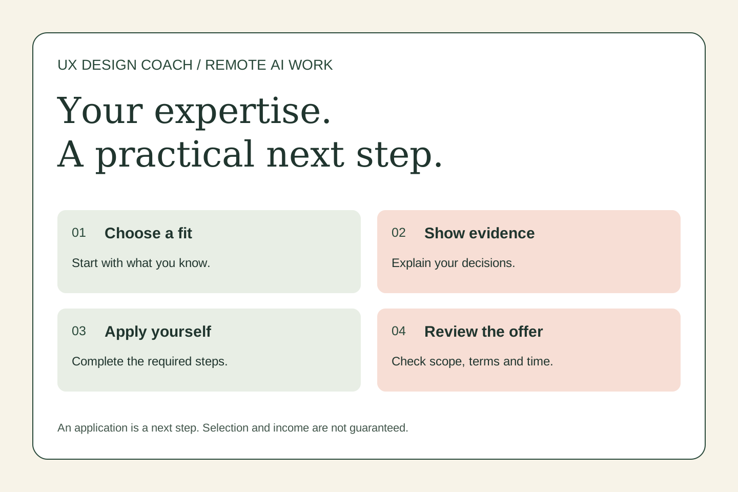 Remote work & AI
UX expertise, remote freelancing, and AI evaluation: a Mercor guide
Designers bring more than screen-making skills. Learn how to describe your research and interaction judgment when exploring remote AI work through Mercor—and how to prepare without overstating what you know.
October 31, 2026 · 5 min read