Design critique
How to write a UX finding a developer can verify
A booking form drops the visitor’s appointment after an email error. Turn that observation into a repair, an acceptance check, and a short client handoff.
In this guide
What makes a UX finding ready to hand off?
Record what you did, what the interface did, and the task you had to repeat. Attach the evidence and describe exactly how someone can check the repair.
“The form is confusing” gives an engineer little to reproduce. “At 390 px, entering an invalid email clears the selected appointment” gives the team a starting state, an action, and an outcome to check.
Walk the error path
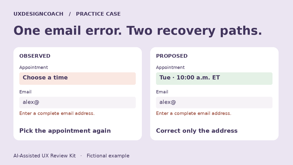
In the fictional example, pick an appointment, enter an invalid email and submit. The email field shows an error, but the appointment has also disappeared. Record this as E02. Capture the state before and after the attempt with fictional details.
Write the smallest defensible finding
The visitor must choose the appointment again to continue. Give this recovery problem high priority in the walkthrough because it forces repeated work on the primary task. How often real visitors hit it, or abandon, remains an open research question.
Give AI a bounded editing job
Ask it to highlight claims in your finding that lack an evidence ID. A draft might say “customers are abandoning booking.” Revise that to “this walkthrough required selecting the slot twice.” Keep a question for analytics or a later usability session if frequency would change the priority.
Specify the repair and its exception
For an email-format error, preserve the selected appointment and all valid fields. Put the message beside the address field. If the slot actually becomes unavailable, explain why and offer a new choice. Silently clearing the field makes a typo and an availability change look identical.
Hand over the acceptance check
Choose an available slot, submit an invalid address, correct only the email, then submit again. The original slot should remain selected and appear in confirmation with its date and time zone. Repeat with a slot made unavailable during correction. The team should see the explicit alternative in that case.
Try the two-page sample
Start with the fictional mobile review, then use the blank recording sheet on one authorized flow.
Get the AI-Assisted UX Review Kit sample
Put one idea to work
Take the next step with a practical worksheet, a clear research question, and a standard you can use to review the work.
Explore design worksheets →Explore more from UX Design CoachGet design practice in your inbox →Keep practicing
 Technology field notes
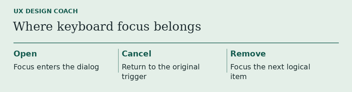
The design looked finished until someone tried to leave the dialog
Run a five-minute keyboard critique on the prototype’s least photogenic moment.
November 17, 2026 · 2 min read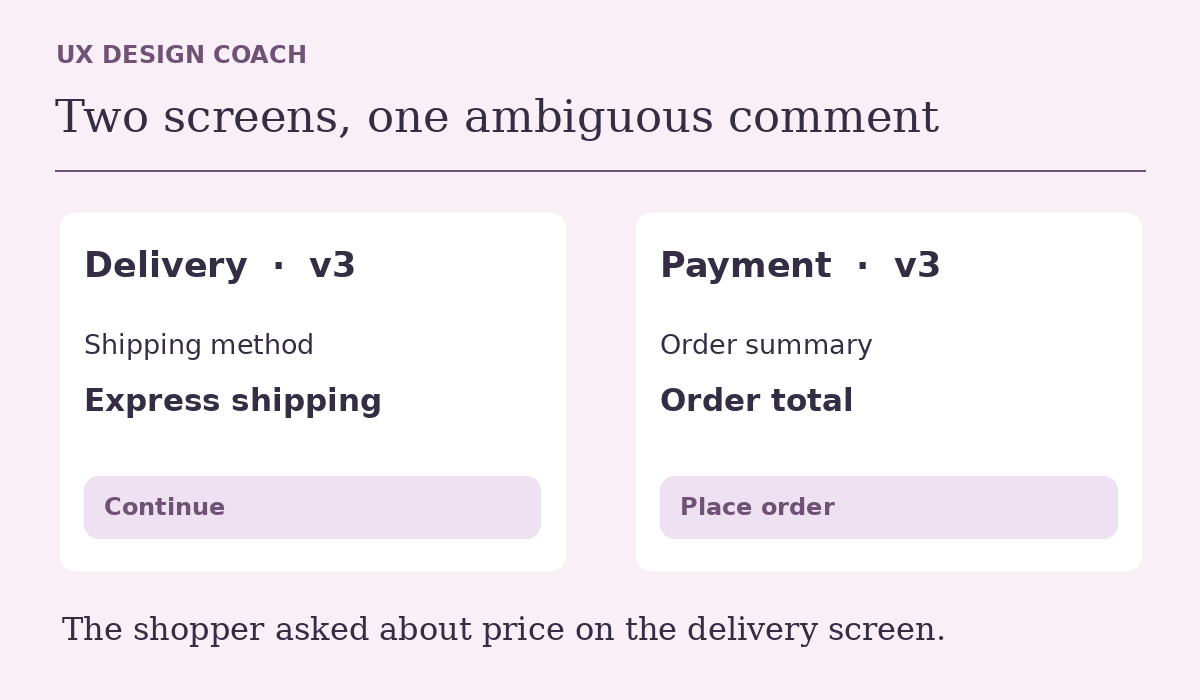 Design critique
Which checkout screen did they mean? A better Figma design critique
Figma can place feedback beside a design. Use a delivery-and-payment example to check whether the note landed on the right frame and whether it warrants a change.
November 17, 2026 · 3 min read